The Magic of Constraint: Why Limited Color Palettes Make Better Pixel Art
When you first open a pixel art editor, the instinct is to reach for every color in the rainbow. After all, more options means more creative freedom, right?
Wrong. Here's the counterintuitive truth that veteran pixel artists know: constraints breed creativity.
Why Limitations Work
The human brain is remarkably good at problem-solving when given boundaries. When you limit yourself to 4 colors (like the original Game Boy) or 54 colors (like the NES), something magical happens:
- Decision fatigue disappears. Instead of agonizing over which shade of blue to use, you pick from a curated selection.
- Color harmony is built-in. Classic palettes were designed to work together. Every color in the NES palette was chosen to complement the others.
- Your art gains cohesion. When every sprite shares the same palette, your game or project looks intentionally designed rather than randomly assembled.
The Palettes That Shaped Gaming
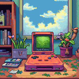
Game Boy (4 colors)
■ Darkest   #0f380f
■ Dark     #306230
■ Light    #8bac0f
■ Lightest #9bbc0f
With only four shades of green, artists had to be clever. They used dithering patterns to create the illusion of additional colors and carefully considered every pixel placement. The result? Some of the most iconic sprite work in gaming history.
NES (54 colors)
The NES palette seems generous compared to the Game Boy, but there's a catch: sprites could only use 3 colors plus transparency. This forced artists to think in terms of highlights, midtones, and shadows—a fundamental skill that applies to all visual art.
PICO-8 (16 colors)
The modern retro palette. PICO-8's carefully curated 16 colors have become a beloved constraint for indie developers and pixel artists. It's restrictive enough to feel retro, but flexible enough to create anything from platformers to RPGs.
Practical Tips for Working with Limited Palettes
1. Start with Silhouettes
Block out your sprite in a single color first. If the shape isn't readable, no amount of shading will save it.
2. Think in Terms of Value
Before picking colors, think about light and dark. Your lightest color catches light, your darkest color creates depth. Everything else is transition.
3. Let Negative Space Work for You
In Pixelverse, the transparent background isn't just absence—it's a design element. Let it define edges and create visual breathing room.
4. Use Dithering Sparingly
Dithering (checkerboard patterns of two colors) can create the illusion of intermediate shades. But overuse it and your sprite becomes noisy. Use it for specific effects like shadows or gradients.
5. Study the Masters
Load up screenshots from classic NES or Game Boy games. See how they solved the same problems you're facing with the same constraints.
Try It Yourself
In Pixelverse, you can switch between palettes instantly. Here's a challenge: create a character sprite using only the Game Boy palette. Then switch to NES. Notice how the additional colors change your approach?
Constraints don't limit creativity—they focus it. The next time you're staring at a blank canvas, try embracing the limitations. You might be surprised what emerges.
What's your favorite limited color palette? Share your Pixelverse creations with us!
Ready to Create Pixel Art?
Try Pixelverse's AI-powered sprite editor - no account required.
Open Pixelverse Editor